UI Case Study of Perfect Properties
The project brief summarized the objective as an “app that provides property buyers with information on properties of interest.”
User goals
I first read the project brief to determine three main goals or features that would satisfy the user needs:
Property information presented clearly and attractively, as well as customizable
Increase efficiency and ease of browsing, research, and communication
Providing tools and help to promote home purchasing as a legacy-building investment

Key customer assumptions
New, small-scale property buyers
Buyers utilize app when searching for properties and decision making
Use of app on mobile and desktop
New buyers are seeking reliable, uncomplicated information regarding property investment; pre-viewing listing is key before spending time visiting a site

User flows
Using the features I determined most salient to develop given the information in the brief, I mapped out the most concise pathways to user success.
This allowed me to visualize which wireframes I needed to start designing, which might be superfluous, and which could be used in multiple tasks.
Developing mood boards
I chose to imply the legacy of generational property ownership and investment with images of family, older homes, and luxury finishes rather than refer directly to financial and data-centric words. The warm brown, pink and taupe earth tones convey security and comfort of home; the accompanying greens connote money, investment, and growth (of property value). There seemed, too, more unique branding opportunities with this color palette; making it a memorable and engaging app that users choose over others in the marketplace.
While the darker colors appear more gender-neutral and lux, I ultimately felt like it felt more clinical and stuffy than what would appeal to and persuade the prompt-given persona. Though important facets of a buyer’s journey, instead of heavy emphasis on efficiency, security, and trust I chose to pursue a branding route that aimed to tie in the emotional component of buying and owning a home. Whereas this darker mood board spoke “property” to me, I this users will prefer the one that feels more like “home”.
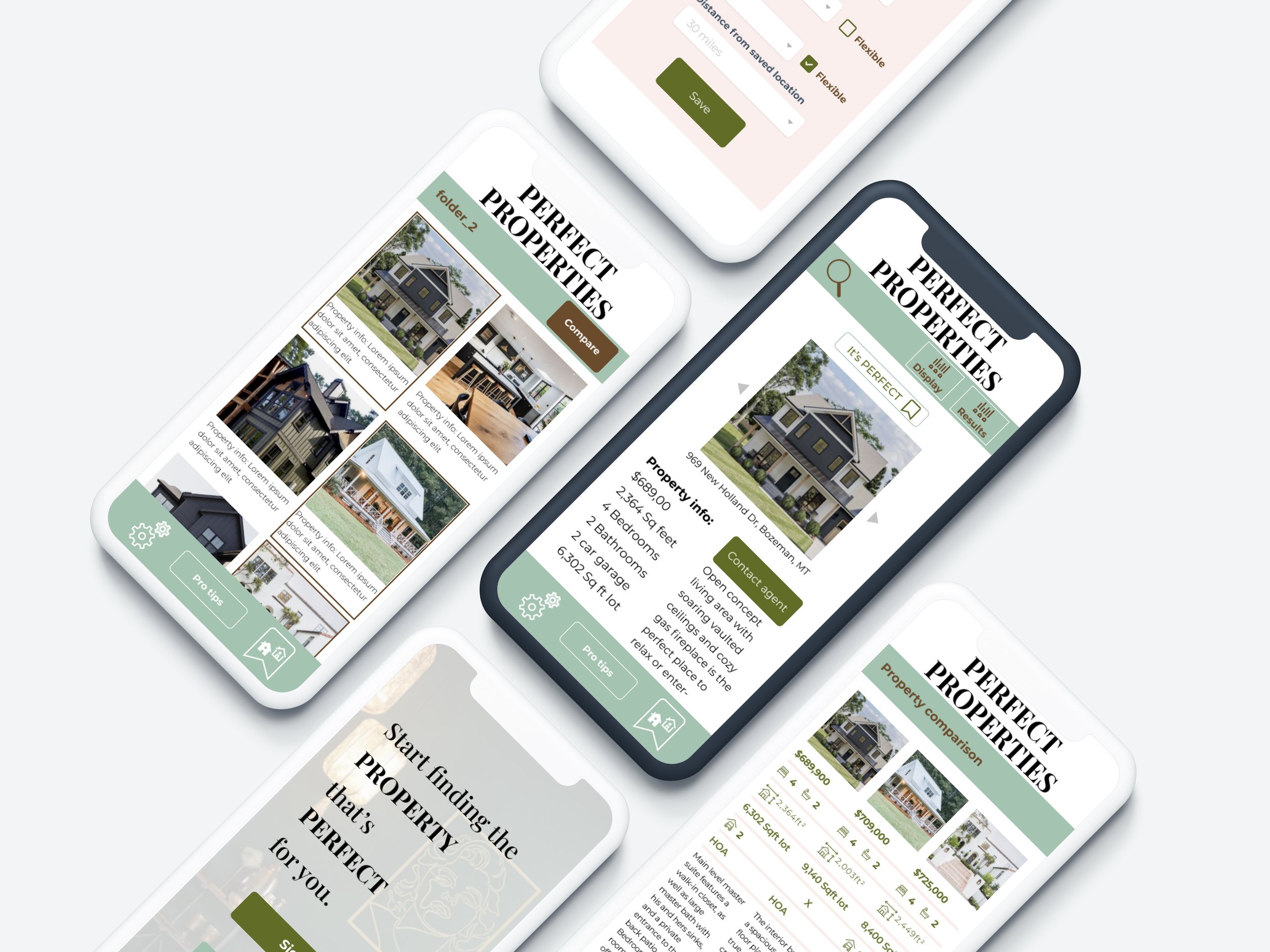
Initial Wireframing


Animation, gesture notation
I developed the Style Guide to best align with the vision set forth by the mood board:
Simplicity and cohesion to allow focus on the salient property information
Neutral earth tones give a sense of grounding and home; heavy use of greens implies money and growth
Icons are clear and concise, used only when necessary
Artistic and aesthetic imagery extends to property pages, too

Next Steps
First and foremost: usability testing of these initial features
Further build out property page to better map out necessary information architecture
Create more detailed animations that will enhance brand identity and a more engaging and enlightening user experience
Design pages for user profile settings and perhaps an in-app messaging tool for users and realtors communication.
Takeaways
When it comes to approaching a project and initially setting up my wireframes I learned from this case study how important an overall framework and consistently utilizing components are both crucial to my conceptualization and execution of a design. This not only increased my efficiency in wireframe building (leaving more time for perfecting details as well as exploring larger-picture business goals) but also ensured a consistency throughout iteration. The project also demonstrated a need to strengthen my ability to execute animation ideas.